- aub brief
- code your own portfolio website
- use CSS, HTML & limited JS
the project;
I kicked off this project with some research, looking at design portfolios on Pinterest, and through the Awwwards portfolio category. I then looked at my current personal branding and adapted it to my current style, ensuring I had different logo options for varying aspects of my website.
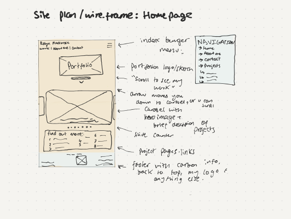
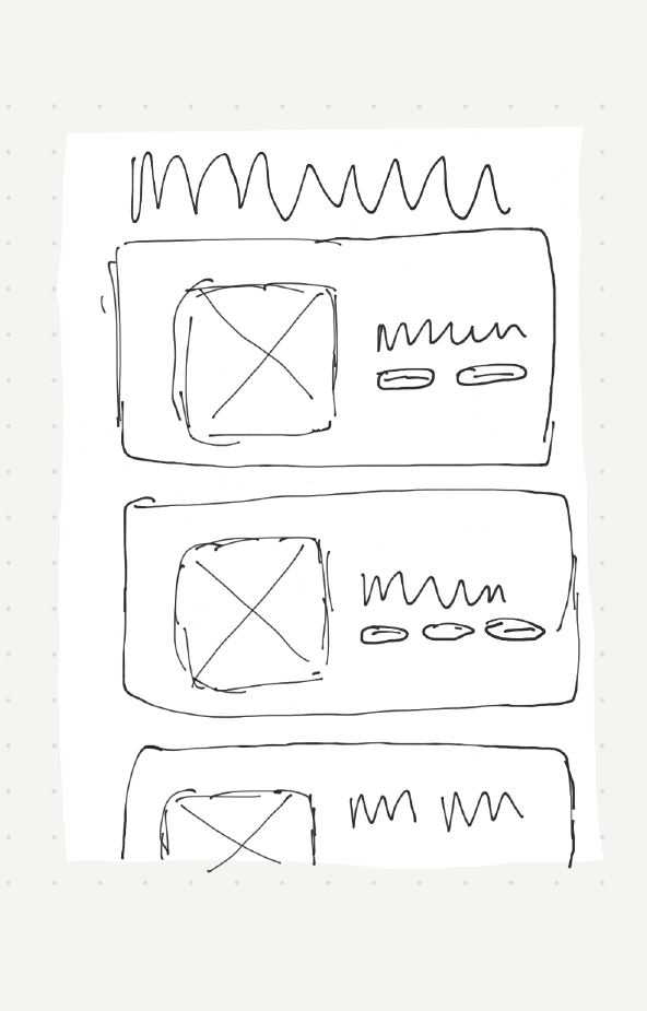
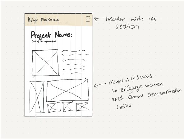
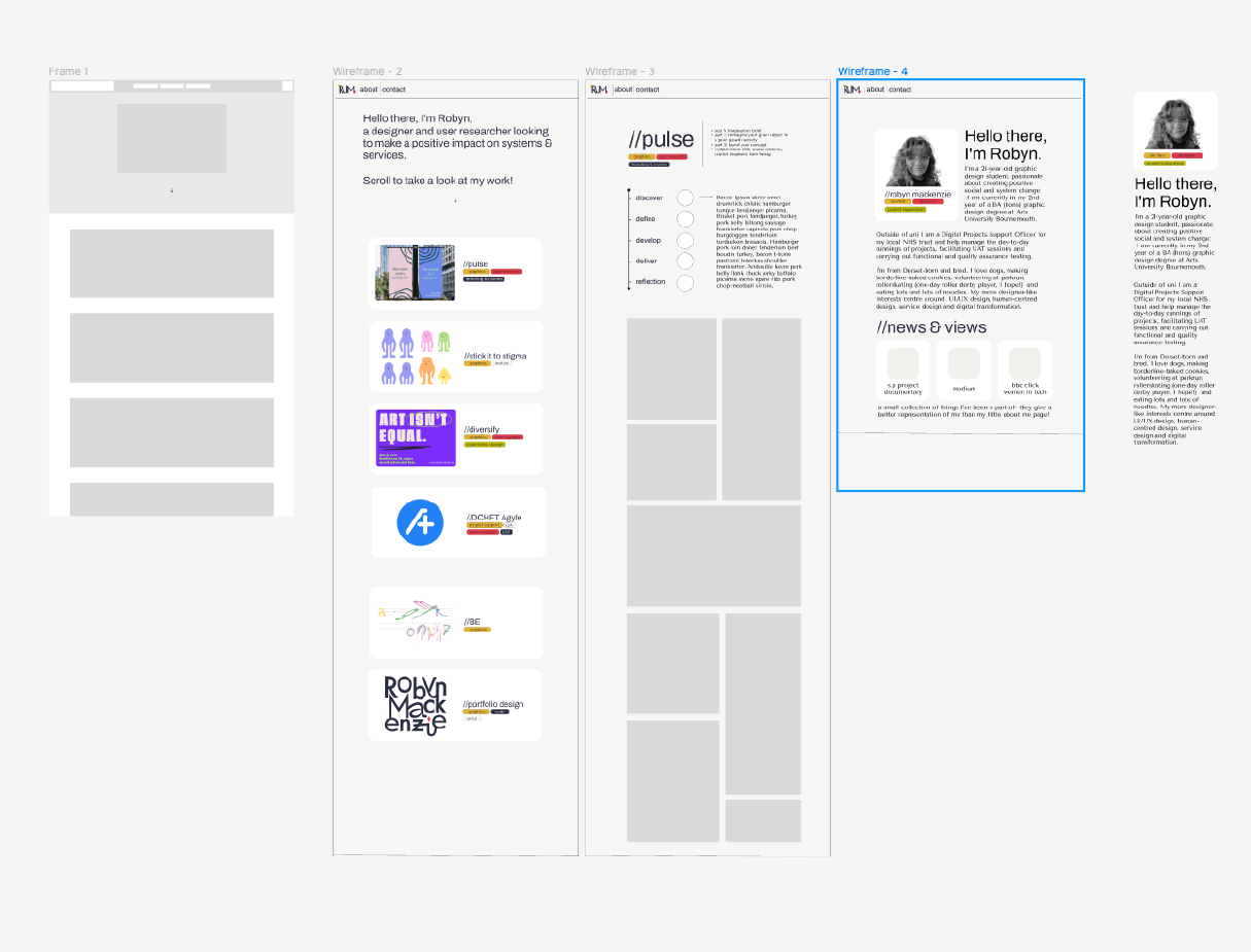
Moving onto wireframing I first sketched some very basic outlines for my website, then quickly went on to utilise Figma and progress the designs further before jumping into coding and testing.
When starting the coding side of the project I edited the given templates to match my Figma designs, focusing on removing unnecessary styles to streamline the CSS. Using grids, I wanted to ensure a good user experience on both mobile and desktop with different layouts for each. I hid certain elements for a cleaner display on smaller screens. To improve navigation, I added a hamburger menu on the mobile view to use screen space efficiently. I then refined the media query and added the viewport meta tag to optimise for mobile viewing. These changes have enhanced the overall usability and design cohesion. I found Firefox Developer Edition and Placehold useful for respectively visualising grids and adding placeholder images.
The next thing I did was edit the style sheet to match my Figma designs visually- changing colours, fonts, alignments and generally tweaking the overall visual presentation. At this point, I began to collate all the media and image files I’d need to display on my site, this was one of the hardest parts! Ensuring everything was the right size and looked cohesive was quite stressful, and I think still needs improvement on some of the project pages.
I realised soon after editing my styles and starting to pad out the about page that I needed to cut back on a lot of the original plans I had in my designs, I scrapped two project pages, as they weren’t required for submission and generating content took too long, I also halted plans for accordion menus on the project pages, and simplified the structure for the about page for the time being.
After some user feedback, I also adapted the nav bar, aligning the destinations to the right on both desktop and mobile versions, and decluttering it by removing borders. There were also a few small bugs- missing alt text, page titles and font issues that were picked up and corrected in user testing.
Ultimately I have learned a lot through this project, it’s been fun to play with code, and I particularly enjoyed the wireframing part of the design process! Being critical with myself I think I need to work on time management, ensuring I leave enough time for multiple rounds of testing, and to give myself space to add more than just minimal viable product features. In future I’d like to improve my about page, and add more projects!